
DoorDash Mobile UX/UI Redesign
INDUSTRY:
Case Study
CLIENT:
UCSD Extensive Program
YEAR:
2024
ROLE:
UX/UI
Contextual Inquiry
Six users in total participated in this project. Three had been given a couple of tasks to complete by using DoorDash, which included:
a) Order boba tea and select pick up at the store.
b) Order two meals, one is vegan, and the other is tofu.
Three field visits were conducted, and interviews were held with three additional users. Some of the users were asked to perform various tasks using think-aloud techniques. Through observation and interviewing, a few problems were identified and mentioned by the participants.
Problem 1 - User Preference
Users often struggle or spend extra time trying to find orders or food items that align with their dietary habits.
Why is this a problem?
Three interviews were conducted with users who vary in their usage frequency of DoorDash: occasional use, frequent use, and reliance on DoorDash due to health issues. The aim was to gather feedback on their experiences. A common issue raised was the lack of support that aligns with user habits and preferences.
Here are a few issues brought up during the interview:
A user has to scroll extensively to find a specific icon in the navigation menu.
Two users spent between half an hour to an hour deciding on food each time.
A user can't search for her past orders. This causes her difficulties as she likes to repeat orders from a while back.
A user consistently sees unrelated promotional deals on the homepage and would prefer a specific prioritization section.
The reminder for the distance surcharge should be more noticeable before customers spend time going through all the food choices.
Solution #1 - Cuisine Navigation Row
Consider personalizing the home menu by arranging it in accordance with the frequency of each user's food orders. Currently, the food genre icons on the menu adapt their display according to the time of day. For instance, during morning hours, you'll notice that coffee and breakfast items are the first two icons. Later in the day, around the afternoon, boba tea takes the leading position. While this approach is thoughtful and tries to predict user behavior, it may not always align with the unique needs and preferences of each user.
Instead of having users scroll through various icons to find their desired food type, it would be far more user-friendly to track and analyze their ordering patterns. By doing so, it can be ensured that the type of cuisine they order the most is displayed as the first item on their menu. This not only saves time but also enhances user experience by making the process more personalized and efficient.
Also, simplifying the homepage by reducing the number of icons and aligning choices with user behaviors can help decrease cognitive load. In the observation of three users navigating the food service, all of them used the search feature more than browsing through cuisine category icons. Instead of making users scroll through a single row crowded with many icons, implementing a "More" option that opens into a panel displaying all available cuisine options in a more organized manner could improve navigation.
The cuisine browsing section should be maintained for users who struggle with spelling. During the observation, an international participant hesitated when asked to search for Filipino cuisine. Instead of directly searching for it, he browsed through the food menu. This differed from his previous behavior, where he directly searched for simpler terms like "tofu".
In addition to the above, trending food options could still be featured based on overall user data. These could serve as suggestions for users looking to try something new or popular. The time of day factor could also be incorporated by including food options that generally match meal times. This way, a more personalized, user-friendly, and efficient menu system that caters to the needs of a diverse user base can be created.

Old Home Page vs. Mockup Page
Solution #2 - Dietary filter
Including a filter option can assist users with dietary needs in easily identifying and finding what they require. The dietary options and labels could be displayed on the home page under the restaurant section and in a filter panel.
In addition to dietary preferences, other features such as an expanded range fee could also be included in the filter. This fee, applied when users browse restaurants beyond a specified distance, cannot currently be filtered out. However, it is a factor that users consider when choosing restaurants. The current setup presents the expanded range fee in small, light gray text on the restaurant page, making it easy to overlook. There's no mention of this on the homepage, so users must click into the restaurant to find this information. This could cause users to spend more time browsing through pages before realizing the restaurant isn't their preferred choice. Displaying a warning sign to remind users that choosing this restaurant will incur an extra delivery fee or is at a distance will assist users in making better selections.

Solution #3 - Hidden Ad banner
Feedback from user interviews indicates that users sometimes see promotions or ads that do not align with their preferences.
To address this issue, two improvements can be made. Firstly, present ads that align with the user's order patterns. Secondly, while still catering to marketing needs, simply provide an option for users to choose when they want to view promotional deals.
Solution #4 - Searching bar
A search bar has been added to the order history page. Usability testing revealed that users prefer to reorder food or choose the same restaurant. Currently, the order history is listed chronologically, requiring users to scroll extensively to find a previous order, which leads to frustration. Introducing a search bar will significantly save time and streamline the ordering process.
Problem 2 - Accessibility & UI Improvement
The current DoorDash user interface (UI) could benefit from further enhancements. Current challenges involve content clustering, lack of clear direction, and ambiguous iconography, among other issues.
Why is this a problem?
Aesthetically pleasing designs positively influence users and greatly enhance their experience with the system, according to the Aesthetic-Usability Effect from User Experience (UX) heuristic. By improving aspects of the UI that are currently causing confusion and clutter, we can assist users in navigating through the app more effectively and pleasantly.
While accessibility has become a vital movement that applies to numerous large companies, DoorDash is also expected to take action to show its consideration for diverse customers and improve their experiences as the largest food delivery service. By paying attention to such trends and making appropriate changes, DoorDash can further cultivate a culture that values inclusivity and user satisfaction.
According to the case study, the author identified several UI issues in the 2023 update. These include unclear iconography, a need better color palette, and the need for visual clarification to assist users in navigating the app and making better decisions.
Solutions
The service and cuisine navigation icons on the Homepage are currently crowded and equally prominent, leading to a cluttered appearance. To improve this, icons could be differentiated: the service menu could utilize square icons that are slightly larger, while cuisine navigation might employ circular icons, making them smaller and less dominant. This proposed change stems from user testing observations, indicating that users predominantly use the search feature for food selections rather than browsing through cuisine icons.
The promotional banner is expanded to fill the entire screen. This enhances its marketing prominence and distinguishes it from other restaurant images.
The filter and option buttons have been relocated closer to the restaurant choices to facilitate quicker selection. This change was made based on the observation that the process of choosing a restaurant and applying filters or options often occurs simultaneously.
Meanwhile, a different font, "Intel," is being introduced to replace the older version. With its taller lowercase letters compared to TT Norms Pro, it will be easier to read on digital platforms. [^1]


Problem 3 - Status and notification
Order cancellation can be frustrating due to limited support and the brief window allowed for reconsideration, along with complicated cancellation steps.
Why is this a problem?
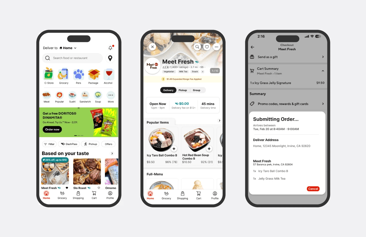
DoorDash offers two methods for canceling an order. The first option is available at the submitting panel when placing an order. A "Go Back" button appears for 5 seconds, offering a very short period for users to reconsider their decision before the order is submitted.
During user testing, one participant unintentionally clicked "place order" and failed to respond within the 5-second window. The brief duration doesn't allow ample opportunity for users unfamiliar with this function to respond.
The second method for canceling an order is less straightforward and is only accessible after the order has been placed but before the restaurant has accepted the submission.
Instead of a direct cancel button, users must navigate to the help section, select "how do I cancel an order?" and proceed from there.
From interviews with three additional users, two immediately expressed the belief that DoorDash does not allow order cancellations. This perception, coupled with the additional steps required for cancellation, can lead to user frustration, especially given that an order cannot be canceled once the restaurant has accepted it.

Solution #1
According to Jakob Nielsen’s usability heuristic, the match between the system and the real world states that the system should use the users’ language[^2]. While “Go back” doesn’t really represent the true meaning of this action, replacing it with "Cancel" will help clarify the function and help users understand how to revoke submissions instantly when the button appears.
Furthermore, implementing a 5-minute buffer period to allow users to edit, change, or reconsider their order will help standardize the process, considering every restaurant may have a different speed in accepting an order submission, making it hard for users to predict and manage their expectations. This buffer period will also benefit restaurants by providing a foresight into upcoming orders.

Solution #2
After a user places an order, the "View Cart" feature on the Homepage will be replaced with an order status reminder. Providing a brief description of what each status means, along with the actions users can take, would significantly enhance understanding.

Conclusion
This case study has identified and proposed solutions to several significant issues within the current DoorDash application. These issues centered around user preference support, UI and accessibility improvements, and the need for better status and notification functionalities. By implementing the proposed solutions, DoorDash can enhance its user-centric approach, leading to an improved user experience, increased customer satisfaction, and ultimately, a stronger market position.
[^1] Dannaway, A. (n.d.). 16 UI Design Rules. Adham Dannaway. Retrieved Feb 18th, 2024, from https://www.adhamdannaway.com/blog/ui-design/16-ui-design-rules
[^2] Kaley, A. (2018, July 1). Match Between the System and the Real World (Usability Heuristic #2). Nielsen Norman Group. https://www.nngroup.com/articles/match-system-real-world/

